Problem:
After the pandemic there was an influx of media streaming service use. Nowadays most people have at least one subscription service that they use to watch movies or shows. With the growing use of different media platforms there comes the frustration of shuffling through all the services. I found that users were struggling to search for shows across multiple platforms.
Goal:
The primary goal of Title Wave was to create a system that would give users their time back by spending less time searching what to watch and more time watching what they want.
My Role:
I ran the User Experience (UX) and the User Interface (UI) for the design. I found it helpful to lean on the people close to me for feedback and guidance.
Design Process:
When I first began this project I ran some research online to find out how the search engines worked within media services, and how other products dealt with this problem. From there I was able to run 5 user interviews to understand just how users use streaming services and how they deal with a search they are unable to find.
Throughout all my research I found that there were common problems between what I read online and from what I learned through my user interviews.
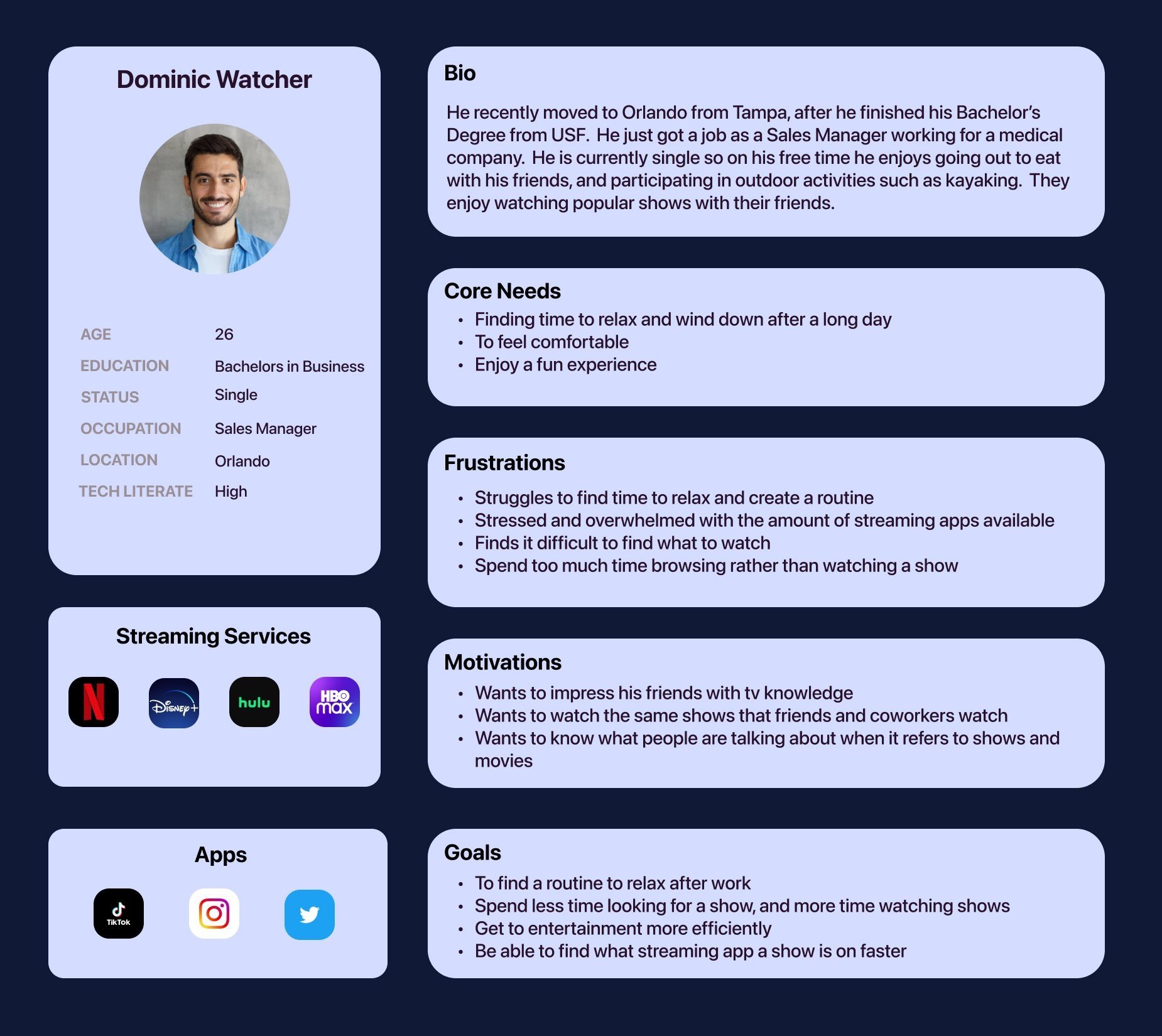
Persona:
Concept :
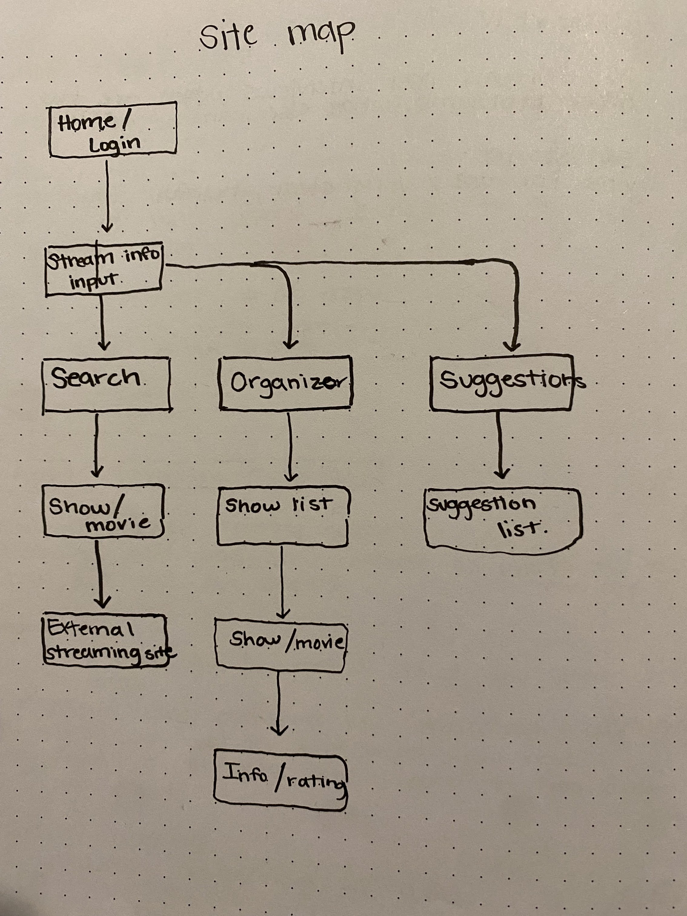
With all the information I was able to collect I was then able to begin conceptualizing the flow of how I wanted my design to go. I began by sketching out what types of pages I wanted for the mobile app. Later creating a revised map of how the interactions would flow together cohesively to be able to reference later in my project.
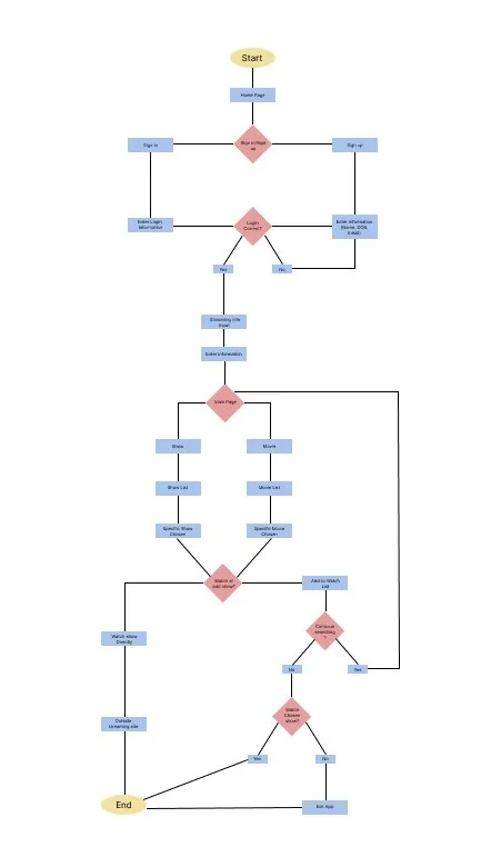
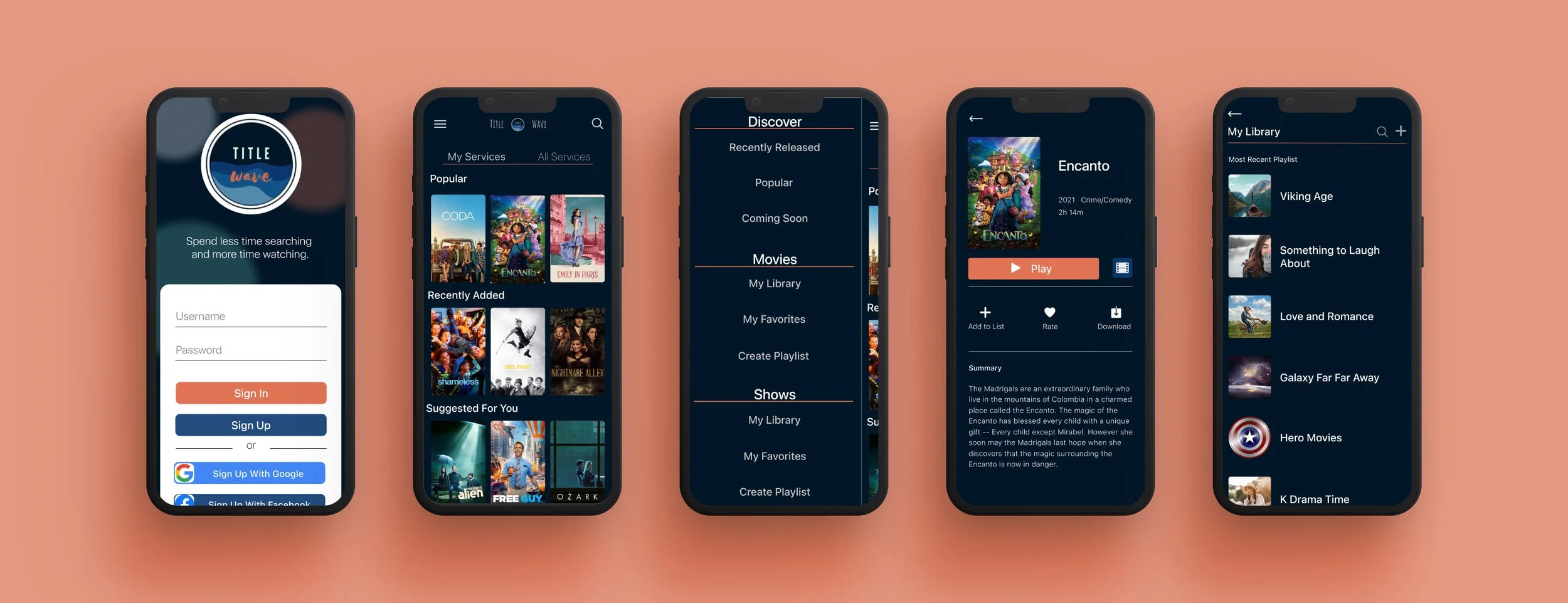
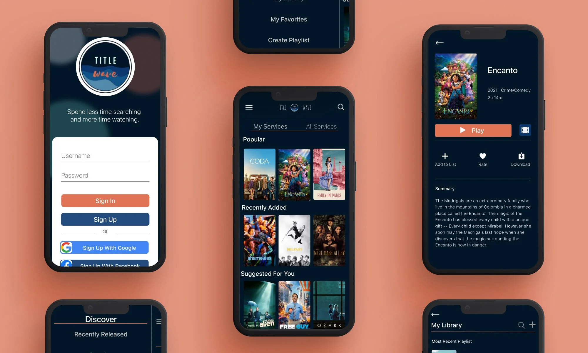
Wireframe:
After creating a user flow map and quick sketches of the screens I was able to then go ahead and create a wireframe for the way I wanted the app to work. The maps help me reference a rough idea of how I wanted the screens to flow together and what specific features I wanted to add. When I was creating the wireframes I was able to visualize the process better which gave me the chance to make quick changes in my design to better fit the idea I wanted to create.

I was able to test my initial wireframe design to understand what users would try to click on and whether the flow of the app made sense.
Moodboard and style guide:
When creating the mood board for this app I wanted to give a relaxing feel so my initial inspiration came from the colors of the sunset. When I began playing around with the colors I found that the colors best suited for the app were a deep blue and orange as the accent with very neutral whites and grays for the rest of the colors.
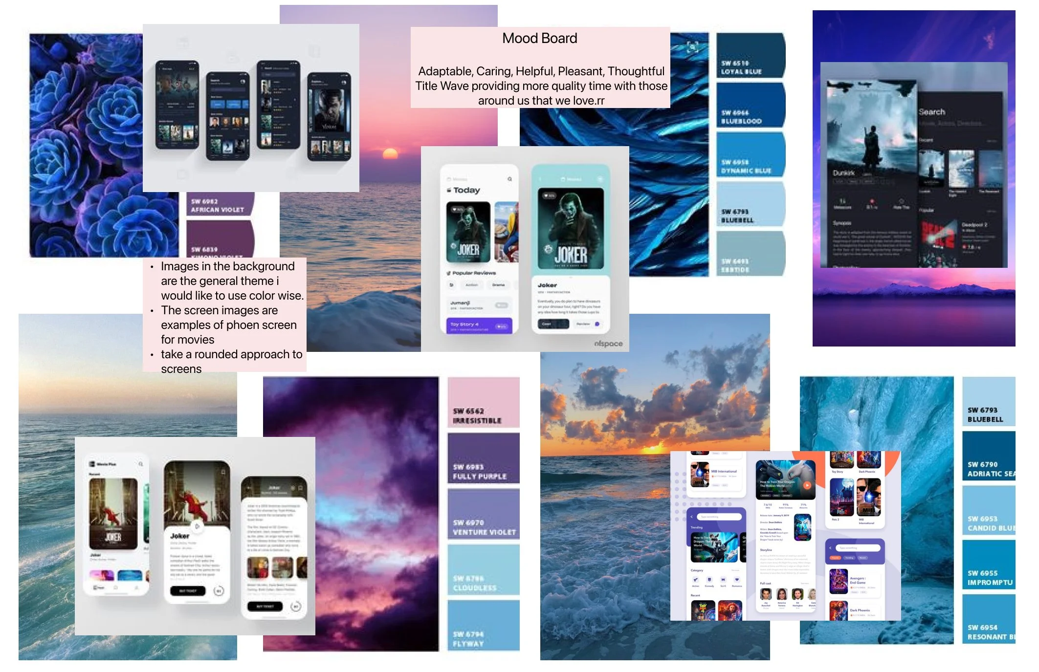
The style guide i created helped me create a more consistent design across all screens of my final designs
What I learned:
Throughout this whole experience I learned a lot about what it takes to be a UX/UI designer. This was really my first project and it was so much fun to work through. One of my biggest faults throughout this project was conducting the interviews. I really learned why you should not use leading questions, these types of questions can really impact the responses you receive from users. Overall there were many mistakes made but i think its the best way to learn sometimes.